
CSS Shapes 101
This article describes styles of different shapes: triangles, parallelograms, diamonds, comic bubbles, and more using CSS only.
BORDER-RADIUS PROPERTY
The border-radius property is an important concept to understand before styling any CSS figures. It allows rounding
corners of HTML elements. The curve for each angle is determined by one or two radii defining its shape — a circle or an
ellipse. The radius extends to the entire background, even if the element has no borders.
The border-radius property allows rounding all corners of HTML elements at the same time. If you set two values for
the border-radius property, the first value will round the upper left and lower right corners, and the second one will
round the upper right and lower left corners. You can use px, em, % or other units to set values.
By using the border-top-left-radius, border-top-right-radius, border-bottom-left-radius, and border-bottom-right-radius properties, you can round each corner in its own way.
The values separated by the slash (/) symbol define the horizontal and vertical radii.
Below are some examples of shapes with different border radii.
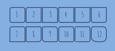
.shape1 { border-radius: 15px; }
.shape2 { border-top-left-radius: 15px; }
.shape3 { border-top-right-radius: 15px; }
.shape4 { border-bottom-left-radius: 15px; }
.shape5 { border-bottom-right-radius: 15px; }
.shape6 { border-radius: 0 0 15px 15px; }
.shape7 { border-radius: 15px 15px 0 0; }
.shape8 { border-radius: 0 10px 20px; }
.shape9 { border-radius: 10px 20px; }
.shape10 { border-radius: 10px/20px; }
.shape11 { border-radius: 5px 10px 15px 30px/30px 15px 10px 5px; }
.shape12 { border-radius: 10px 20px 30px 40px/30px; }

.shape {
  display: inline-block;
  width: 100px;
  height: 100px;
  border: 5px solid #32557f;
}
CIRCLE
A circle is the simplest CSS shape. Apply the border-radius: 50%; property to an element with identical width and height, and you’ll get a circle.

.circle {
  background: #32557f;
  width: 200px;
  height: 200px;
  border-radius: 50%;
}
OVALS/ELLIPSES
Ovals are made in the same way as circles. The only difference is that ovals’ width should be different from its height.

.ellipse {
  background: #32557f;
  width: 200px;
  height: 100px;
  border-radius: 50%;
}
HALF-ELLIPSES
To make half-ellipses, use sets of values separated by the slash (/) symbol to define the horizontal and vertical radii. If you put 50% before the slash symbol, you will get a vertical half-ellipse. And if you put 50% after the slash symbol, you’ll get a horizontal half-ellipse. Combinations of 0 and 100% values define the direction of your half-ellipse.
See the examples below:
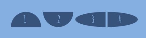
.half-ellipse1 { border-radius: 50% / 100% 100% 0 0; }
.half-ellipse2 { border-radius: 50% / 0 0 100% 100%; }
.half-ellipse3 { border-radius: 100% 0 0 100% / 50%; }
.half-ellipse4 { border-radius: 0 100% 100% 0 / 50%; }

.half-ellipse {
  background: #32557f;
  width: 150px;
  height: 75px;
}
QUARTER-ELLIPSES
To make quarter-ellipses, use combinations of 0 and 100% values.
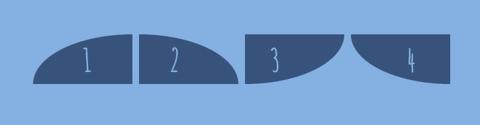
.quarter-ellipse1 { border-radius: 100% 0 0 0; }
.quarter-ellipse2 { border-radius: 0 100% 0 0; }
.quarter-ellipse3 { border-radius: 0 0 100% 0; }
.quarter-ellipse4 { border-radius: 0 0 0 100%; }

.quarter-ellipse {
  background: #32557f;
  width: 150px;
  height: 75px;
}
CONE
And here is how you make a cone:

.cone {
  width: 0;
  height: 0;
  border-left: 70px solid transparent;
  border-right: 70px solid transparent;
  border-top: 100px solid #32557f;
  border-radius: 50%;
}
TRIANGLES
CSS triangles are useful to create arrows, for example, in a select element or inside buttons.
To make a triangle, create a box with zero width and height.
.triangle {
  width: 0;
  height: 0;
}
The actual width and height of the arrow are determined by the width of the border. In an up arrow, for example, the bottom-border is colored while the left and right are transparent, which forms the triangle.

.triangle .triangle-up {
  border-left: 50px solid transparent;
  border-right: 50px solid transparent;
  border-bottom: 100px solid #32557f;
}

.triangle .triangle-down {
  border-left: 50px solid transparent;
  border-right: 50px solid transparent;
  border-top: 100px solid #32557f;
}

.triangle .triangle-left {
  border-top: 50px solid transparent;
  border-right: 100px solid #32557f;
  border-bottom: 50px solid transparent;
}

.triangle .triangle-right {
  border-top: 50px solid transparent;
  border-left: 100px solid #32557f;
  border-bottom: 50px solid transparent;
}
To make a right triangle (a right-angled triangle), make the top or bottom border colored and leave the right or left border transparent.

.triangle .triangle-top-left {
  border-top: 100px solid #32557f;
  border-right: 100px solid transparent;
}

.triangle .triangle-top-right {
  border-top: 100px solid #32557f;
  border-left: 100px solid transparent;
}

.triangle .triangle-bottom-left {
  border-bottom: 100px solid #32557f;
  border-right: 100px solid transparent;
}

.triangle .triangle-bottom-right {
  border-bottom: 100px solid #32557f;
  border-left: 100px solid transparent;
}
ARROWS
To create a simple arrow without a tail, make a box with a width and height, border, as well as zero left and top borders.
.arrow {
  width: 15px;
  height: 15px;
  border: 2px solid #32557f;
  border-left: 0;
  border-top: 0;
}
To make an up arrow, add the transform: rotate(225deg); property, and to make a down arrow, add the transform: rotate(45deg); property to rotate the arrow to 225 and 45 degrees respectively.
.arrow-up { transform: rotate(225deg); }
.arrow-down { transform: rotate(45deg); }
You can also make a curved arrow with a tail:

.arrow-curved {
    position: relative;
    width: 0;
    height: 0;
    border-top: 9px solid transparent;
    border-right: 9px solid #32557f;
    transform: rotate(10deg);
}
.arrow-curved:after {
    content: "";
    position: absolute;
    border: 0 solid transparent;
    border-top: 3px solid #32557f;
    border-radius: 20px 0 0 0;
    top: -12px;
    left: -9px;
    width: 12px;
    height: 12px;
    transform: rotate(45deg);
}
And below is an example of how to create an arrow-pointer:

.arrow-pointer {
  width: 250px;
  height: 50px;
  background: #32557f;
  position: relative;
}
.arrow-pointer:after {
  content: '';
  position: absolute;
  left: 0; bottom: 0; width: 0; height: 0;
  border-left: 25px solid #7eb4e2;
  border-top: 25px solid transparent;
  border-bottom: 25px solid transparent;
}
.arrow-pointer:before {
  content: '';
  position: absolute;
  right: -25px;
  bottom: 0;
  width: 0;
  height: 0;
  border-left: 25px solid #32557f;
  border-top: 25px solid transparent;
  border-bottom: 25px solid transparent;
}
DIAMONDS
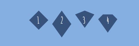
.diamond1 {
  width: 0;
  height: 0;
  border: 50px solid transparent;
  border-bottom-color: #32557f;
  position: relative;
  top: -50px;
}
.diamond1:after {
  content: '';
  position: absolute;
  left: -50px;
  top: 50px;
  width: 0;
  height: 0;
  border: 50px solid transparent;
  border-top-color: #32557f;
}

.diamond2 {
  width: 0;
  height: 0;
  border: 50px solid transparent;
  border-bottom: 70px solid #32557f;
  position: relative;
  top: -50px;
}
.diamond2:after {
  content: '';
  position: absolute;
  left: -50px;
  top: 70px;
  width: 0;
  height: 0;
  border: 50px solid transparent;
  border-top: 70px solid #32557f;
}

.diamond3 {
  width: 0;
  height: 0;
  border: 50px solid transparent;
  border-bottom: 20px solid #32557f;
  position: relative;
  top: -50px;
}
.diamond3:after {
  content: '';
  position: absolute;
  left: -50px;
  top: 20px;
  width: 0;
  height: 0;
  border: 50px solid transparent;
  border-top: 70px solid #32557f;
}

.diamond4 {
  border-style: solid;
  border-color: transparent transparent #32557f transparent;
  border-width: 0 25px 25px 25px;
  height: 0;
  width: 50px;
  box-sizing: content-box;
  position: relative;
  margin: 20px 0 50px 0;
}
.diamond4:after {
  content: '';
  position: absolute;
  top: 25px;
  left: -25px;
  width: 0;
  height: 0;
  border-style: solid;
  border-color: #32557f transparent transparent transparent;
  border-width: 70px 50px 0 50px;
}
PENTAGON
A pentagon is a five-sided polygon.

.pentagon {
  position: relative;
  width: 54px;
  box-sizing: content-box;
  border-width: 50px 18px 0;
  border-style: solid;
  border-color: #32557f transparent;
}
.pentagon:before {
  content: '';
  position: absolute;
  height: 0;
  width: 0;
  top: -85px;
  left: -18px;
  border-width: 0 45px 35px;
  border-style: solid;
  border-color: transparent transparent #32557f;
}
HEXAGON
A hexagon is a six-sided polygon.

.hexagon {
  width: 100px;
  height: 55px;
  background: #32557f;
  position: relative;
}
.hexagon:before {
  content: '';
  position: absolute;
  top: -25px;
  left: 0;
  width: 0;
  height: 0;
  border-left: 50px solid transparent;
  border-right: 50px solid transparent;
  border-bottom: 25px solid #32557f;
}
.hexagon:after {
  content: '';
  position: absolute;
  bottom: -25px;
  left: 0;
  width: 0;
  height: 0;
  border-left: 50px solid transparent;
  border-right: 50px solid transparent;
  border-top: 25px solid #32557f;
}
STARS
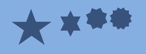
A five-pointed star:
.star-five {
  position: relative;
  display: block;
  width: 0px;
  height: 0px;
  margin: 50px 0;
  color: #32557f;
  border-left: 100px solid transparent;
  border-right: 100px solid transparent;
  border-bottom: 70px solid #32557f;
  transform: rotate(35deg);
}
.star-five:before {
  content: '';
  position: absolute;
  top: -45px;
  left: -65px;
  display: block;
  height: 0;
  width: 0;
  border-left: 30px solid transparent;
  border-right: 30px solid transparent;
  border-bottom: 80px solid #32557f;
  transform: rotate(-35deg);
}

.star-five:after {
  content: '';
  position: absolute;
  top: 3px;
  left: -105px;
  display: block;
  width: 0px;
  height: 0px;
  color: #32557f;
  border-left: 100px solid transparent;
  border-right: 100px solid transparent;
  border-bottom: 70px solid #32557f;
  transform: rotate(-70deg);
}
A six-pointed star:
.star-six {
  width: 0;
  height: 0;
  border-left: 50px solid transparent;
  border-right: 50px solid transparent;
  border-bottom: 100px solid #32557f;
  position: relative;
}
.star-six:after {
  content: '';
  position: absolute;
  top: 30px;
  left: -50px;
  width: 0;
  height: 0;
  border-top: 100px solid #32557f;
  border-left: 50px solid transparent;
  border-right: 50px solid transparent;
}
A eight-pointed star:
.star-eight {
    background: #32557f;
    width: 80px;
    height: 80px;
    position: relative;
    text-align: center;
    transform: rotate(20deg);
}
.star-eight:before {
    content: '';
    position: absolute;
    top: 0;
    left: 0;
    height: 80px;
    width: 80px;
    background: #32557f;
    transform: rotate(135deg);
}
A twelve-pointed star:
.star-twelve {
  background: #32557f;
  width: 80px;
  height: 80px;
  position: relative;
  text-align: center;
}
.star-twelve:before,
.star-twelve:after {
  content: '';
  position: absolute;
  top: 0;
  left: 0;
  height: 80px;
  width: 80px;
  background: #32557f;
}

.star-twelve:before {
  transform: rotate(30deg);
}

.star-twelve:after {
  transform: rotate(60deg);
}
BUBBLES

// SASS styles

.bubble {
  position: relative;
  width: 120px;
  height: 80px;
  background: #32557f;
  border-radius: 10px;
}

.bubble1 {
  @extend .bubble;

  &::before {
    content: '';
    position: absolute;
    left: 0;
    top: 50%;
    width: 0;
    height: 0;
    border: 13px solid transparent;
    border-right-color: #32557f;
    border-left: 0;
    margin-top: -13px;
    margin-left: -13px;
  }
}

.bubble2 {
  @extend .bubble;

  &::after {
    content: '';
    position: absolute;
    right: 0;
    top: 50%;
    width: 0;
    height: 0;
    border: 13px solid transparent;
    border-left-color: #32557f;
    border-right: 0;
    margin-top: -13px;
    margin-right: -13px;
  }
}

.bubble3 {
  @extend .bubble;

  &::after {
    content: '';
    position: absolute;
    top: 0;
    left: 50%;
    width: 0;
    height: 0;
    border: 13px solid transparent;
    border-bottom-color: #32557f;
    border-top: 0;
    margin-left: -13px;
    margin-top: -13px;
  }
}

.bubble4 {
  @extend .bubble;

  &::after {
    content: '';
    position: absolute;
    bottom: 0;
    left: 50%;
    width: 0;
    height: 0;
    border: 13px solid transparent;
    border-top-color: #32557f;
    border-bottom: 0;
    margin-left: -13px;
    margin-bottom: -13px;
  }
}
BUBBLES WITH BORDERS

.bubble5 {
    position: relative;
    width: 280px;
    height: 80px;
    padding: 5px;
    color: #32557f;
    border-radius: 5px;
    border: 3px solid #32557f;
}
.bubble5:before,
.bubble5:after {
    content: '\0020';
    display: block;
    position: absolute;
    top: -15px;
    left: 15px;
    z-index: 2;
    width: 0;
    height: 0;
    overflow: hidden;
    border: solid 15px transparent;
    border-top: 0;
    border-bottom-color: #7eb4e2;
}

.bubble5:before {
    top: -18px;
    z-index: 1;
    border-bottom-color: #32557f;
}
To make a bubble with a shadow, add an additional div element for the arrow.
<div class="bubble6"> <div class="bubble6-arrow"></div> </div>.bubble6 {
position: relative;
width: 280px;
height: 80px;
background: #efefef;
border: 1px solid #a7a7a7;
border-radius: 4px;
box-shadow: 4px 4px 0 rgba(0, 0, 0, .2);
padding: 15px;
}
.bubble6-arrow {
position: absolute;
right: 15px;
bottom: -25px;
border-left: 21px solid transparent;
border-top: 20px solid rgba(0, 0, 0, .2);
}
.bubble6-arrow:before {
content: '';
position: absolute;
right: 5px;
bottom: 2px;
border-left: 23px solid transparent;
border-top: 23px solid #a7a7a7;
}
.bubble6-arrow:after {
content: '';
position: absolute;
right: 6px;
bottom: 4px;
border-left: 21px solid transparent;
border-top: 21px solid #efefef;
}BRACKETS

.brackets {
  width: 100px;
  height: 100px;
  border: 5px solid #32557f;
  border-top: none;
  border-bottom: none;
  border-radius: 30px/90px;
}
CROSS

.cross {
  background: #32557f;
  height: 50px;
  position: relative;
  width: 10px;
}
.cross:after {
  background: #32557f;
  content: '';
  height: 10px;
  left: -20px;
  position: absolute;
  top: 20px;
  width: 50px;
}
EGG

.egg {
  display: block;
  width: 130px;
  height: 175px;
  background-color: #32557f;
  border-radius: 50% 50% 50% 50% / 60% 60% 40% 40%;
}
FLAG

.flag {
  width: 110px;
  height: 56px;
  box-sizing: content-box;
  padding-top: 15px;
  position: relative;
  background: #32557f;
  color: #7eb4e2;
  font-size: 11px;
  letter-spacing: 0.2em;
  text-align: center;
  text-transform: uppercase;
}
.flag:after {
  content: '';
  position: absolute;
  left: 0;
  bottom: 0;
  width: 0;
  height: 0;
  border-bottom: 13px solid #7eb4e2;
  border-left: 55px solid transparent;
  border-right: 55px solid transparent;
}
HEART

.heart {
  position: relative;
  width: 120px;
  height: 100px;
}
.heart:before,
.heart:after {
  position: absolute;
  content: '';
  left: 60px;
  top: 0;
  width: 60px;
  height: 90px;
  background: #32557f;
  border-radius: 60px 60px 0 0;
  transform: rotate(-45deg);
  transform-origin: 0 100%;
}
.heart:after {
  left: 0;
  transform: rotate(45deg);
  transform-origin: 100% 100%;
}
INFINITY SYMBOL

.infinity {
  position: relative;
  width: 106px;
  height: 50px;
  box-sizing: content-box;
}
.infinity:before,
.infinity:after {
  content: '';
  box-sizing: content-box;
  position: absolute;
  top: 0;
  left: 0;
  width: 30px;
  height: 30px;
  border: 10px solid #32557f;
  border-radius: 50px 50px 0 50px;
  transform: rotate(-45deg);
}
.infinity:after {
  left: auto;
  right: 0;
  border-radius: 50px 50px 50px 0;
  transform: rotate(45deg);
}
LEAVES

// SASS styles

.leaf {
  width: 100px;
  height: 100px;
  border: 5px solid #32557f;
}

.leaf1 {
  @extend .leaf;
  border-radius: 0 100%;
}

.leaf2 {
  @extend .leaf;
  border-radius: 0 50% 50% 50%;
}
LOCK

.lock {
  font-size: 4px;
  position: relative;
  top: 10em;
  width: 18em;
  height: 13em;
  border-radius: 2em;
  box-sizing: border-box;
  border: 3.5em solid #32557f;
  border-right-width: 7.5em;
  border-left-width: 7.5em;
}
.lock:before {
  content: '';
  box-sizing: border-box;
  position: absolute;
  top: -12em;
  left: 50%;
  width: 14em;
  height: 12em;
  margin-left: -7em;
  border: 2.5em solid #32557f;
  border-top-left-radius: 7em;
  border-top-right-radius: 7em;
}
.lock:after {
  content: "";
  box-sizing: border-box;
  position: absolute;
  top: -1em;
  left: 50%;
  width: 5em;
  height: 8em;
  border: 1em solid #32557f;
  border-radius: 2.5em;
  margin-left: -2.5em;
}
MAGNIFYING GLASS

.magnifying-glass {
  font-size: 5em;
  display: inline-block;
  width: 0.4em;
  box-sizing: content-box;
  height: 0.4em;
  border: 0.1em solid #32557f;
  position: relative;
  border-radius: 0.35em;
}
.magnifying-glass:before {
  content: '';
  display: inline-block;
  position: absolute;
  right: -0.25em;
  bottom: -0.1em;
  border-width: 0;
  background: #32557f;
  width: 0.35em;
  height: 0.08em;
  transform: rotate(45deg);
}
PAC-MAN

.pac-man {
  width: 0px;
  height: 0px;
  border-top: 60px solid #32557f;
  border-right: 60px solid transparent;
  border-bottom: 60px solid #32557f;
  border-left: 60px solid #32557f;
  border-top-left-radius: 60px;
  border-top-right-radius: 60px;
  border-bottom-left-radius: 60px;
  border-bottom-right-radius: 60px;
}